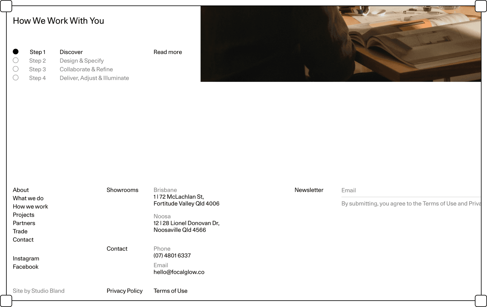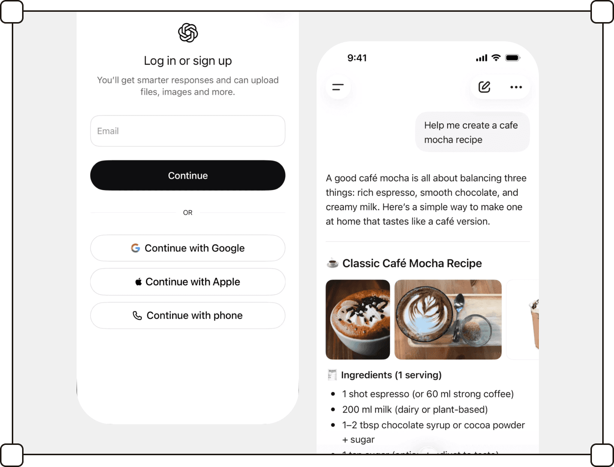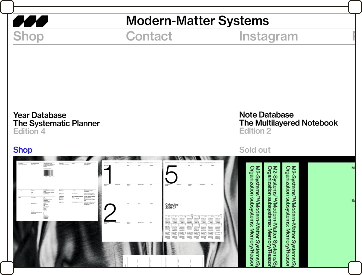
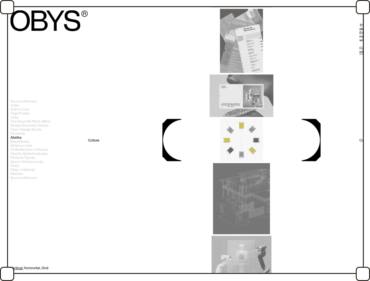

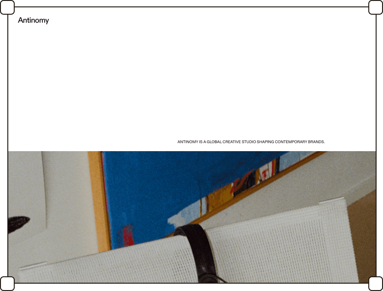


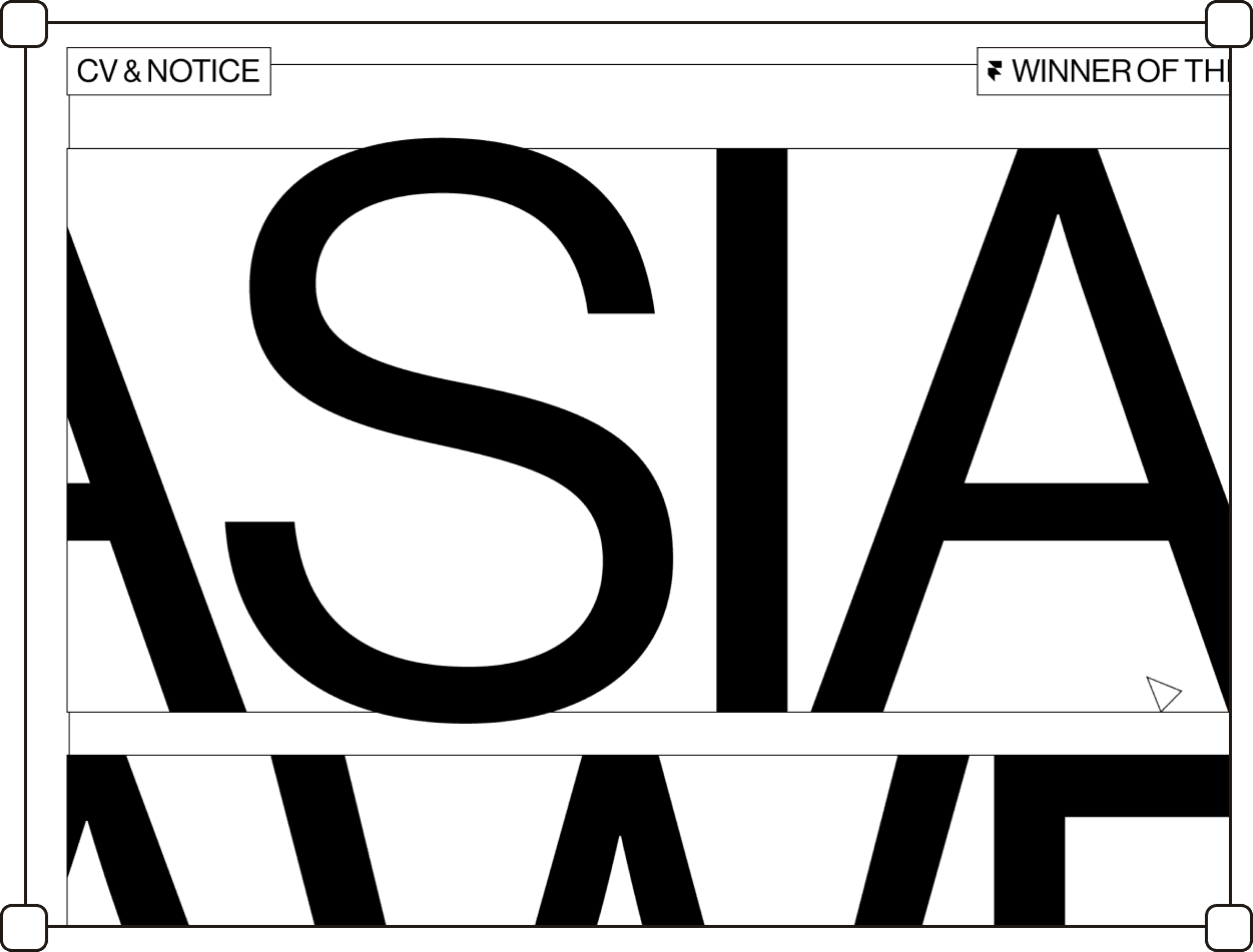
Type sets the hierarchy, whitespace does the rest. Color and decoration only appear when they carry functional weight
Intro
The term "new utilitarian" originates from the concept of utilitarianism, which philosopher Jeremy Bentham defined as the pursuit of maximizing "utility," understood as happiness and well-being.
Victionary, the publisher that introduced this term along with a publication of the same name, points to its roots in 1950s Swiss design, emphasizing order, precision, and geometry.
In interface design, new utilitarian means typography as the primary carrier of hierarchy, an achromatic or very limited palette, and grid-based layouts.
Every visual element justifies its presence. The final effect engages the user without the need to wade through visual noise.
Content separation is most often achieved using straight lines. Victionary describes this style as the "new Swiss graphic style," a reinterpretation of the popular typographic style for the digital context.
Summary
listed
Sep 2026
Also known as
Neo-Swiss, Type-Led Design, Functional Minimalism
Sources
victionary
Featured designers
2023
Typography

Color palette

Illustrations

Corner rounding

Frame shapes

Gradients

Borders

Separators

Containers

Transparency

Shadows
Iconography