Cream backgrounds, serif type, and earthy palettes — a reaction to a decade of sterile white interfaces, built on the visual language of print, paper, and things that exist outside a screen.
Intro
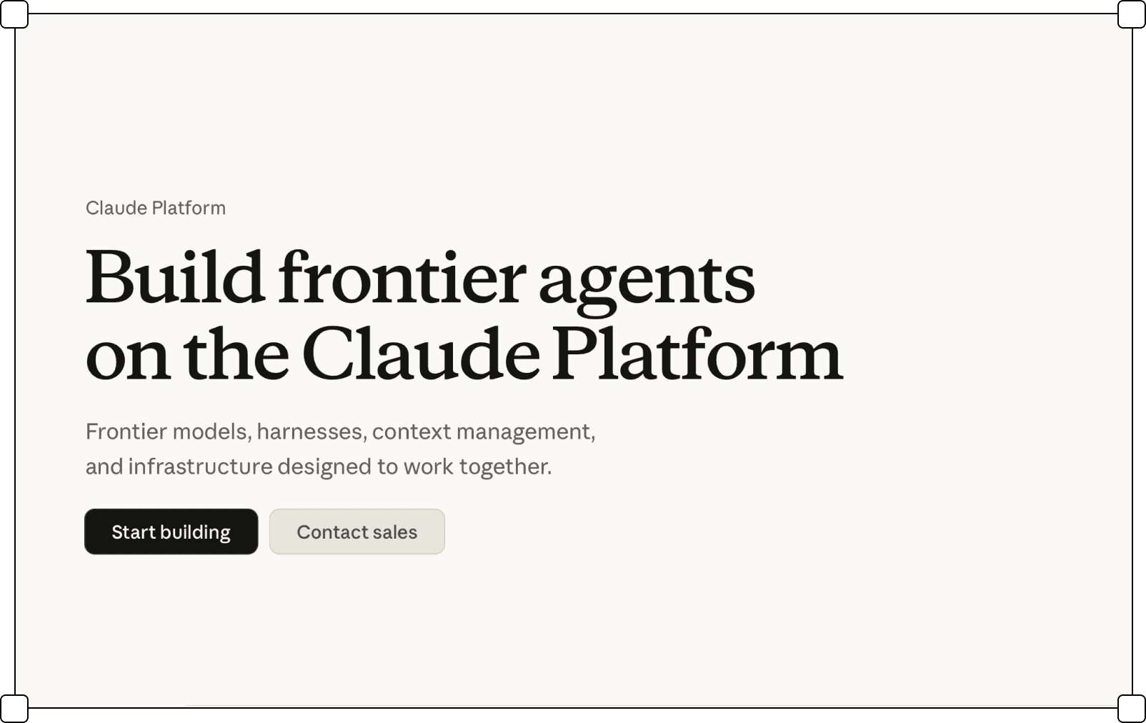
The trend contrasts with the sterile, cold appearance of interfaces that use extreme color values. White is softened by beige and creamy backgrounds.
Sans-serif fonts give way to more humanist serifs, suggesting warmth, editorial quality, and a physical book.
The palette may be based on earthy/coffees browns, organic/plant greens, or sunny-fruity oranges. Cream instead of white, a serif font that carries the history of printing and editing, a palette closer to what is organic than what is bright — browns, greens, oranges that exist beyond the monitor.
Overall vibe: as if technology were reading books and drinking coffee.
The result is interfaces that do not hide that they have an author. Hand-drawn illustrations, irregular textures, colors that do not come from the system palette — these are marks of decisions, not accidents. In an environment where most tools look like they were produced by the same design system, the presence of character becomes information in itself.
Summary
listed
Sep 2026
Also known as
Post-Sterile, Organic Digital
Sources
Mobbin.com, Landbook.com
Typography
Bezszeryfowy krój ustępuje bardziej humanistycznym szeryfom, sugerującym ciepło, redakcyjność, fizyczną książkę. Szeryfy szczególnie często stosowane są w nagłówkach, podczas gdy paragrafy są domeną bezszeryfowych krojów.

Color palette

Illustrations

Corner rounding
Layers order

Frame shapes
Description

Gradients
Borders

Separators
Transparency

Shadows

Iconography